top of page

Panacea
BRIEF: Create three different radial patterns using illustrated vector icons. Conceptualize a brand name and color palette for a brand of tea, wine, or other beverage and utilize the patterns as part of the branding and packaging design. All illustrations and mockups were created on Adobe Illustrator.

Initial drawings for the packaging included vector illustrations of teapots, mugs, leaves, spoons, and other shapes conceptually related to tea. I arranged the shapes in a number of ways before settling on this specific pattern, then started applying a color palette.


I maintained a limited color palette consisting of four high-contrast colors (three neutrals in the beige, brown, and gold along with the blue accent) and two shades of green primarily for accents, in that I decided not to use the greens for backdrops. I focused on establishing rules for a color system and sticking to them, and created three sample layouts using the palette.


I maintained a limited color palette consisting of four high-contrast colors (three neutrals in the beige, brown, and gold along with the blue accent) and two shades of green primarily for accents, in that I decided not to use the greens for backdrops. I focused on establishing rules for a color system and sticking to them, and created three sample layouts using the palette.
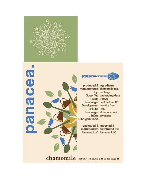
After establishing the three colorways, I devised a text logo and used assets from my radial pattern to illustrate a rough dieline of potential tea boxes. I tried to envision Panacea boxes in different arrangements on a shelf, and wanted the different colorways to be easily distinguishable from one another from multiple angles. I also used a stroke-only version of the radial design as both an accent on the top of the box and as a texture within the spoon.
I maintained a limited color palette consisting of four high-contrast colors (three neutrals in the beige, brown, and gold along with the blue accent) and two shades of green primarily for accents, in that I decided not to use the greens for backdrops. I focused on establishing rules for a color system and sticking to them, and created three sample layouts using the palette.
After establishing the three colorways, I devised a text logo and used assets from my radial pattern to illustrate a rough dieline of potential tea boxes. I tried to envision Panacea boxes in different arrangements on a shelf, and wanted the different colorways to be easily distinguishable from one another from multiple angles. I also used a stroke-only version of the radial design as both an accent on the top of the box and as a texture within the spoon.

Final mockup of three colorways/flavors of tea in 3D box format
bottom of page